Kerala Workers (2011)
The roots of education are bitter, but the fruit is sweet.
Intro
You can skip ahead to the end result here!
My first attempt to learn d3js – A JavaScript framework that can help create data driven visualizations.
I’m following this tutorial mostly.
Goals
- Create an empty project
- Get the project ready
- Make it work
- Make it work better
- Make something real
Create an empty project
mkdir -p ~/projects/d3js_intro && cd ~/projects/d3js_intro
touch index.html index.js style.css
-
Create a folder for your project:
projects/d3js_intro/ -
Add these empty files:
- index.html
- index.js
- style.css
- Create an empty project
Get the project ready
Create skeletons for the project
index.html
<!DOCTYPE html>
<html lang="en">
  <head>
    <link rel="stylesheet" href="style.css">
  </head>
  <body>
    <h1>Hello, world!</h1>

    <script src="https://d3js.org/d3.v4.min.js"></script>
    <script src="index.js"></script>
  </body>
</html>
- Leave
index.jsandstyle.cssempty for now.
- Get the project ready
Make it work
Making it work means getting SOMETHING up and running.
This step is basically a super simple smoke test.
index.js
var data_set = [1,2,3,4,5];

d3.select('body')
  .selectAll('p')
  .data(data_set)
  .enter()
  .append('p')
  .text(function(d) { return "This is paragraph #" + d; } );
Which looks like this:
- Make it work
Make it work better
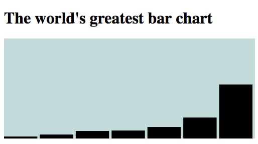
Now we make it work better. Let’s create a bar chart.
First, some simple styling:
style.css
.bar-chart {
  background-color: #C7D9D9;
}
Add an SVG element to your page:
index.html
<!-- only pasting relevant portion to keep the code sample short -->
<body>
  <h1>The world's greatest bar chart</h1>

  <svg class="bar-chart"></svg>

  <script src="https://d3js.org/d3.v4.min.js"></script>
  <script src="index.js"></script>
</body>
index.js
var data_set = [4, 8, 15, 16, 23, 42, 108];

var svg_width = 500, svg_height = 200, bar_padding = 5;
var bar_width = (svg_width / data_set.length);

var svg = d3.select('svg').attr("width", svg_width).attr("height", svg_height);

var bar_chart = svg.selectAll("rect")
      .data(data_set)
      .enter()
    .append("rect")
      .attr("y", function(d) { return svg_height - d })
      .attr("height", function(d) { return d; })
      .attr("width", bar_width - bar_padding)
      .attr("transform", function (d, i) {
          var translate = [bar_width * i, 0];
          return "translate("+ translate +")";
      });
The result looks like this:
- Make it work better
Make something real
You can skip ahead to the end result here!
First, get some data and clean it up so that it’s ready to be consumed.
Next, decide which points of data to present and strip out everything else.
-
Take a look at the CSV file with just the information we want.
-
The scope here is to show Region-Sex-Education for given Age groups.
style.css
h1 {
  color: #003d5d;
  font: 33.34px Lato, "Helvetica Neue", Helvetica, Arial, "Lucida Grande", sans-serif;
}

.bar-chart {
  background-color: #eaeaea;
}

/* Sex */

svg .male {
  fill:   #003d5d;
  stroke: #4c778d;
}

svg .female {
  fill:   #f23d5d;
  stroke: #601825;
}

/* Region */

svg .rural {
  opacity: 1.0;
}

svg .urban {
  opacity: 0.5;
}

/* Education */

svg .literate {
  stroke-width: 3px;
}

svg .illiterate {
  stroke-width: 0px;
}

/* Toolip */

rect:hover {
  fill: orange;
}

#tooltip {
  position: absolute;
  width: 200px;
  height: auto;
  padding: 10px;
  background-color: orange;
  -webkit-border-radius: 10px;
  -moz-border-radius: 10px;
  border-radius: 10px;
  -webkit-box-shadow: 4px 4px 10px rgba(0, 0, 0, 0.4);
  -moz-box-shadow: 4px 4px 10px rgba(0, 0, 0, 0.4);
  box-shadow: 4px 4px 10px rgba(0, 0, 0, 0.4);
  pointer-events: none;
}

#tooltip.hidden {
  display: none;
}

#tooltip p {
  margin: 0;
  font-family: Futura;
  font-size: 16px;
  line-height: 20px;
}
index.js
var margin = { top: 10, right: 10, bottom: 90, left: 60 },
    svg_width = (1350 - margin.left - margin.right),
    svg_height = (800 - margin.top - margin.bottom),
    bar_padding = 5;

d3.csv('kerala_workers_age_sex_education_2011.csv',
        (csv_data) => draw_bar_chart(get_data_set(csv_data)));

function draw_bar_chart(data_set) {
  var raw_values = data_set.map(d => parseInt(d.value)),
      bar_width = ((svg_width / data_set.length ) - bar_padding);;

  var max_value = d3.max(raw_values),
      min_value = d3.min(raw_values),
      mean      = d3.mean(raw_values);

  var y_scale = d3.scaleLinear()
        .domain([0, (max_value + (mean/2))])
        .range([svg_height, 0]);

  var svg = d3.select('svg').attr('width', svg_width).attr('height', svg_height);

  var y_axis = d3.axisLeft().scale(y_scale);
  svg.append('g').attr('transform', 'translate(55, 10)').call(y_axis);

  var bar_chart = svg.selectAll("rect")
        .data(data_set)
        .enter()
      .append("rect")
        .attr('class', function(d) { return d.class })
        .attr("y", function(d) { return y_scale(d.value) })
        .attr("height", function(d) { return svg_height - y_scale(d.value); })
        .attr("width", bar_width)
        .attr("transform", function (d, i) {
            var translate = [(bar_width + bar_padding) * i + margin.left, 0];
            return "translate("+ translate +")";
        })
        .on('mouseover', function(d, i) {
          var x_position = parseFloat((bar_width + bar_padding) * i + margin.left) / 2;
          var y_position = parseFloat(d3.select(this).attr("y")) / 2 + svg_height / 2;

          d3.select("#tooltip")
              .style("left", x_position + "px")
              .style("top", y_position + "px");

          d3.select("#group").text(d.label);
          d3.select("#region").text(d.region);
          d3.select("#education").text(d.education);
          d3.select("#value").text(d.value);

          d3.select("#tooltip").classed("hidden", false);
        })
        .on('mouseout',  function() { d3.select("#tooltip").classed("hidden", true); })
}

function get_data_set(csv) {
  var sex_with_age_ranges = csv.columns.filter(x => x[0] == 'F' || x[0] == 'M');
  return sex_with_age_ranges.map(range => age_range_data_object(range, csv))
          .reduce((acc, val) => acc.concat(val), []);
}

function age_range_data_object(range, csv_data) {
  return csv_data.map(row => transform_to_object(range, row));
}

function transform_to_object(range, row) {
  var sex       = range[0] == 'M' ? 'male' : 'female';
  var region    = row['Region'].toLowerCase();
  var education = row['Educational level'].toLowerCase();

  return {
    'label': range,
    'class': [sex, region, education].join(' '),
    'value': row[range],
    'region': region.toUpperCase(),
    'education': education.toUpperCase()
  };
}
index.html
<!DOCTYPE html>
<html lang="en">
  <head>
    <link rel="stylesheet" href="style.css">
  </head>
  <body>
    <h1>Kerala - Workers by Age, Education, Region, and Sex (2011)</h1>

    <div id="tooltip" class="hidden">
      <p>Sex & Age: <span id="group">sex-age-group</span></p>
      <p>Region: <span id="region">rural</span></p>
      <p>Education: <span id="education">literate</span></p>
      <p>Population: <span id="value">100</span></p>
    </div>
    <svg class="bar-chart"></svg>

    <script src="https://d3js.org/d3.v4.min.js"></script>
    <script src="index.js"></script>
  </body>
</html>
- Make something real
Some Takeaways
- Cleaning up the data took a large majority of the time.
- I didn’t write idomatic JavaScript becuase I’m not super familiar with it, so maybe that could’ve sped things up a bit.
- SVG’s axes take some getting used to.
- I found some posts suggesting you rotate the entire thing -90 degrees to have the (0,0) origin at the bottom left corner. I’ll try that next time.
- Having a clear idea of what the visualization should look saves a lot of time.
- I had a lot of internal “back and forths” because I didn’t know how I wanted the chart to look from the beginning.
Additional Reading
Some additional reading I found helpful: